Building stronger foundations
Previous identity
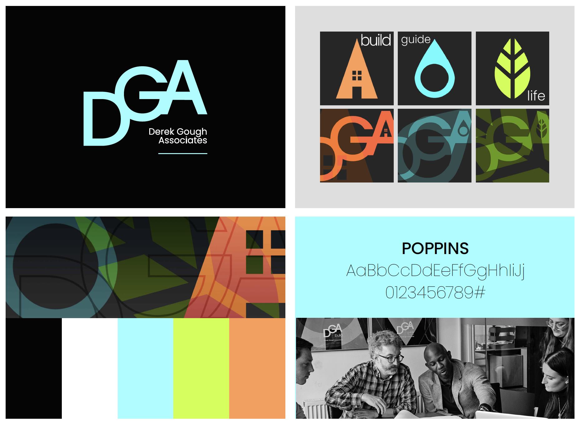
Despite being a successful disruptor in the quantity surveying industry, DGA found that its brand no longer reflected how the business (or its clients) saw themselves. Whilst there was equity in the existing identity, it had become increasingly difficult to use consistently and effectively.
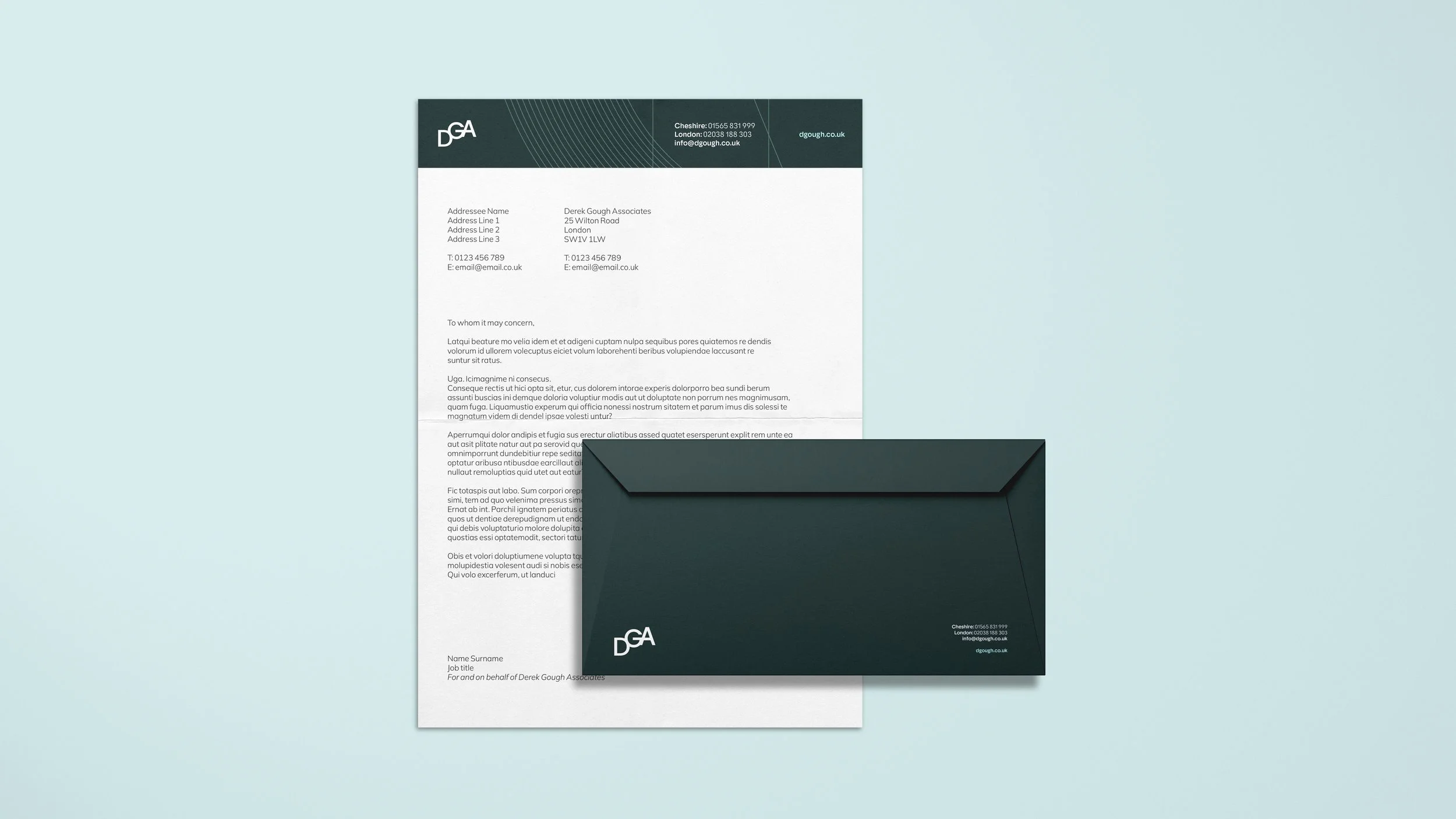
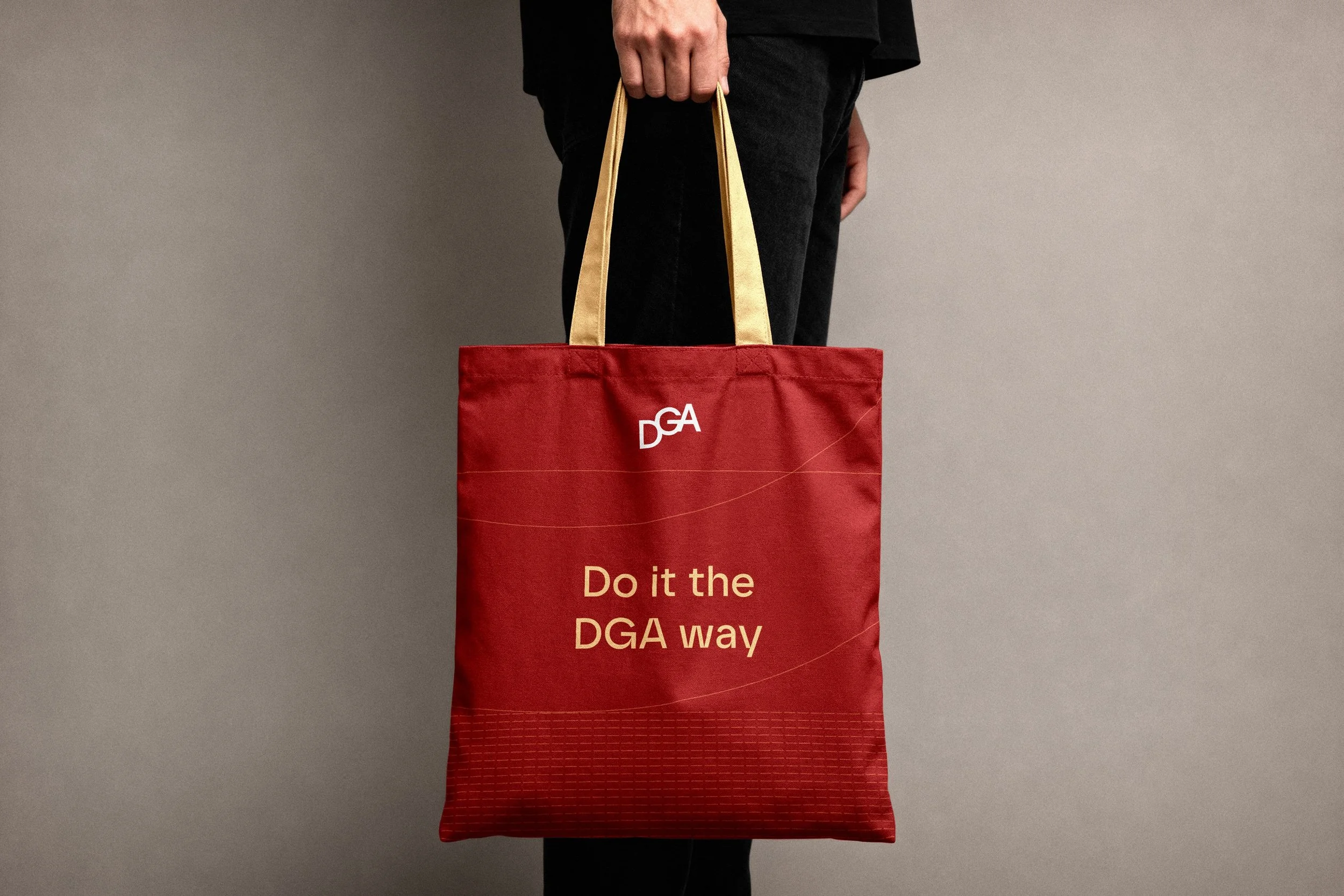
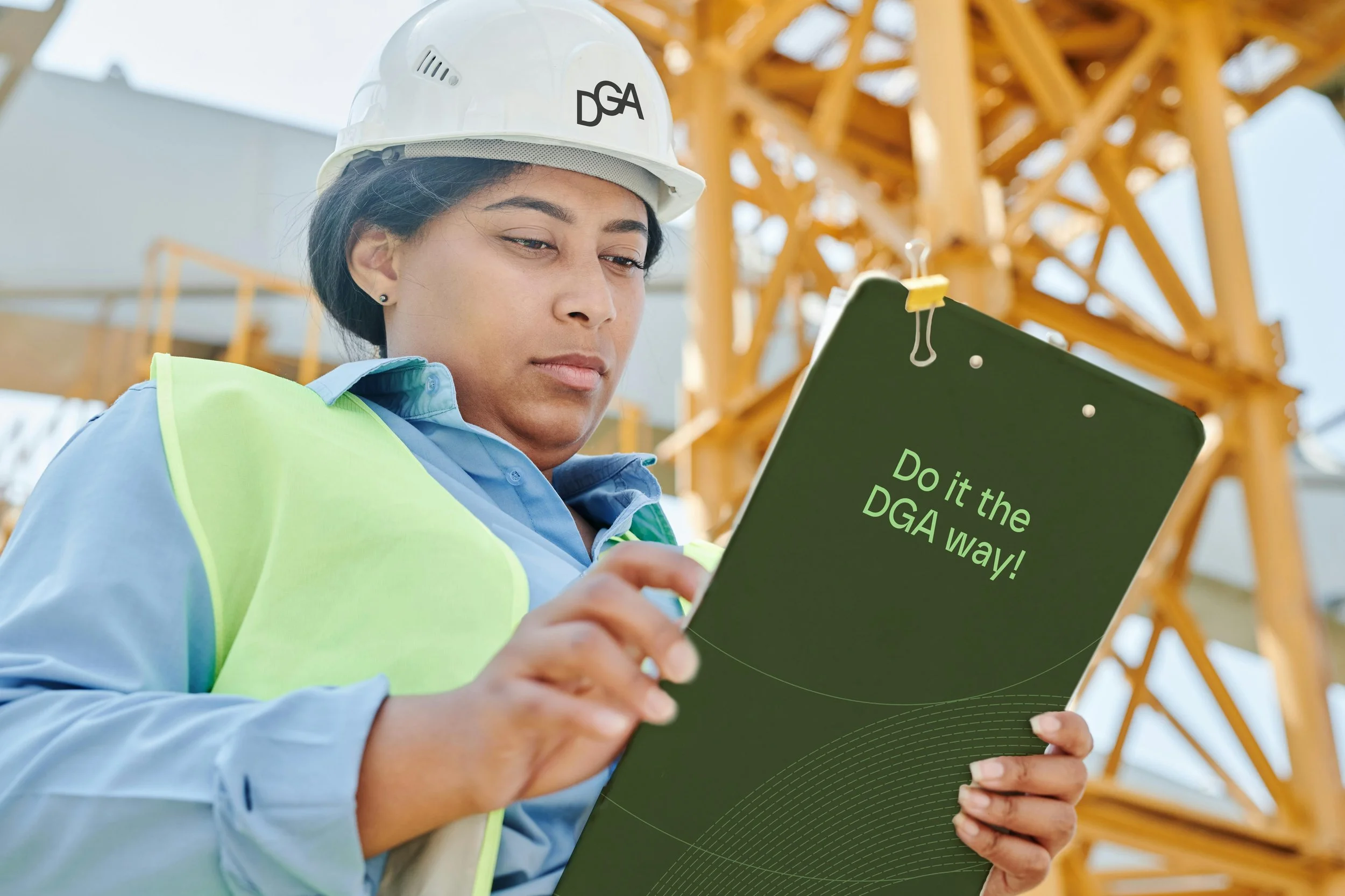
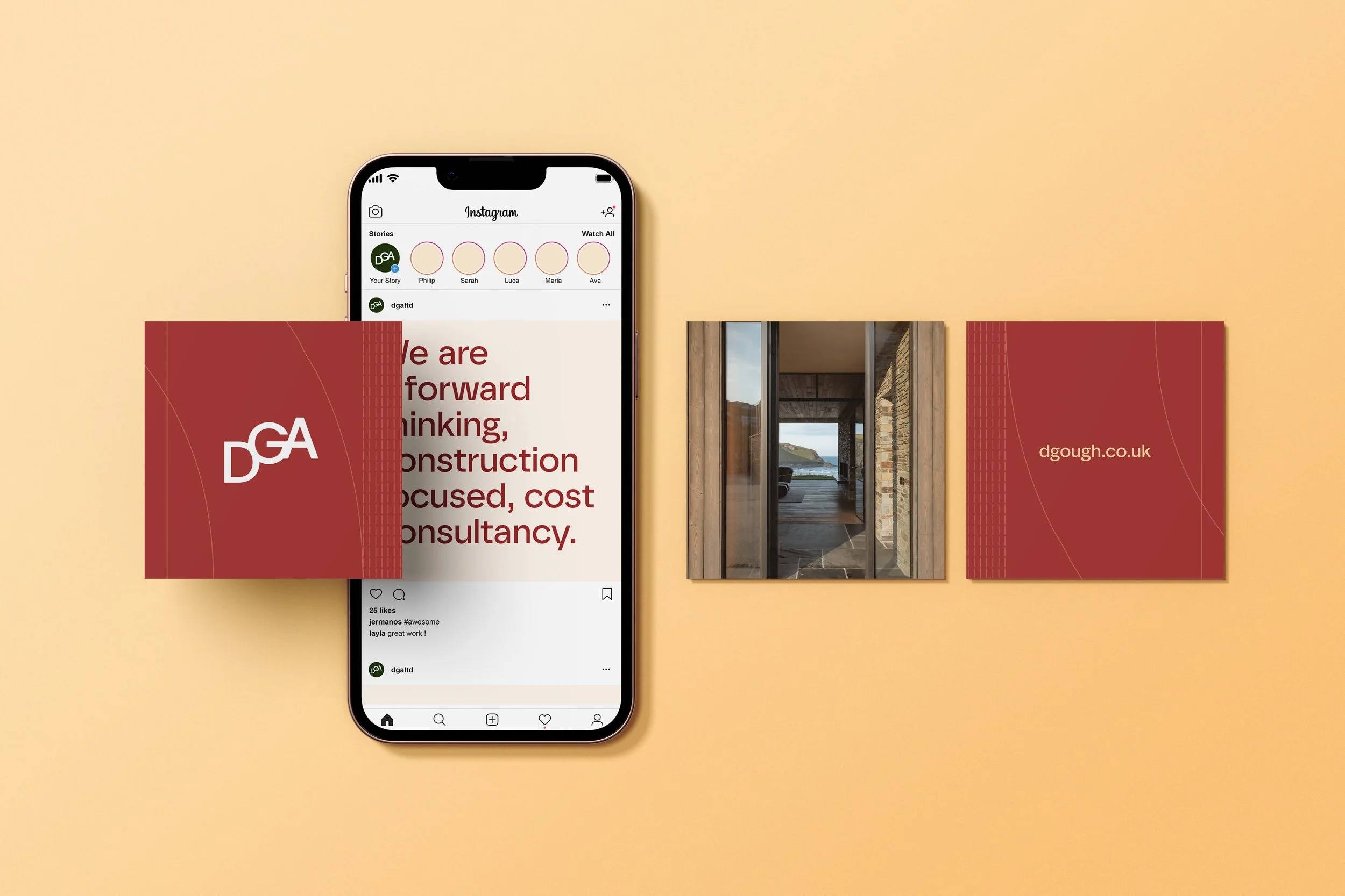
Building on what was already loved, I evolved the visual identity to better reflect DGA’s expertise, ambition and distinctive position in the industry. A new Tone of Voice, alongside refreshed Vision, Mission and Values, helped bring greater clarity and confidence to the brand, reinvigorating how DGA presents itself and feels about its business.
The ‘flexigon’
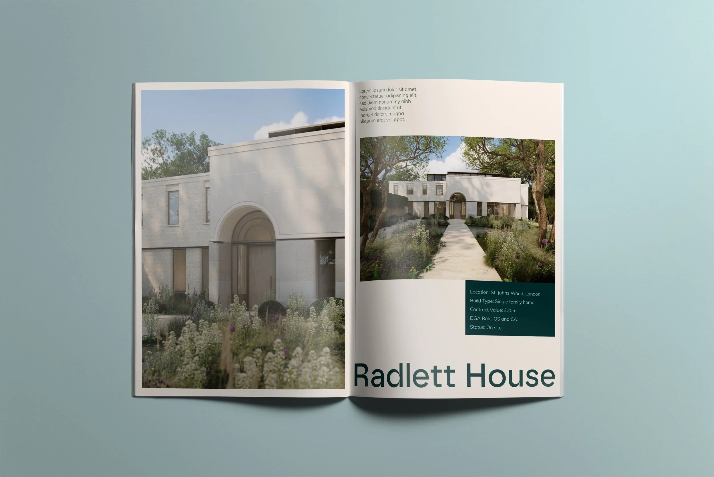
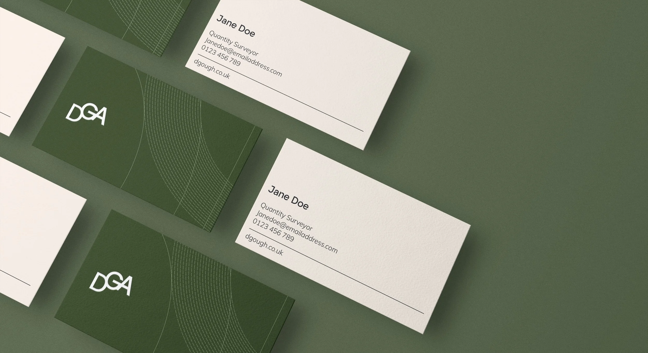
Drawing from the brand's logo we used the shape of the hexagonal logo, adding dimension and expressiveness by seeing it as a moving 3D object. We also used this to inform additional shapes throughout the design, from UI elements to image holding devices.